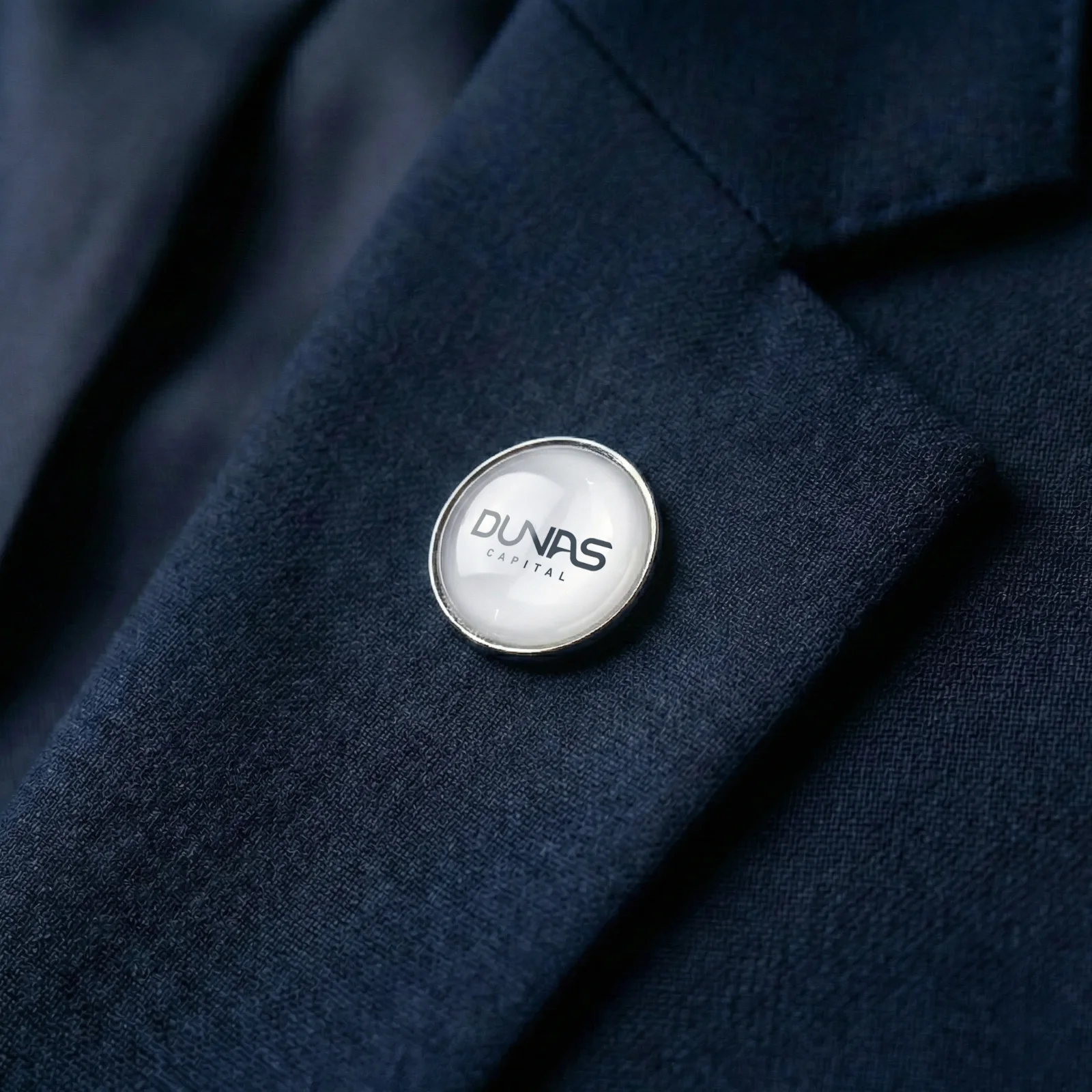
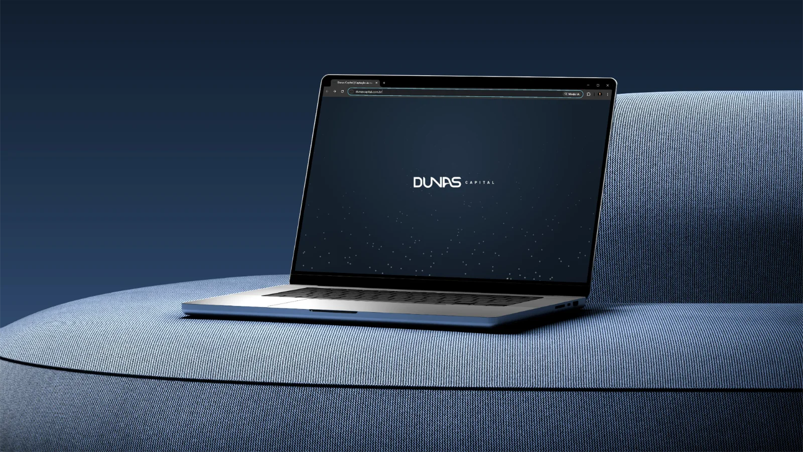
Dunas sold fundraising, but what it delivered, and what made clients stay, was innovation that works.
Campaign image · Glitch
Client
Dunas Capital
Period
2026, ongoing
Format
Diagnosis, brand and product
Delivered
Identity, site and digital product
01 · The challenge
Where we started from.
01diagnosis to bring promise and delivery closer.
Brand, site and posts told only the first part: the fundraising. The work began by separating the service Dunas sells from the transformation it makes possible for its clients.
The diagnosis with partners and teams gave a clear basis to rebuild the company’s message, identity and touchpoints.
The starting point
Dunas sold fundraising, but the value clients perceived came from the innovation the company makes possible. The new brand brought promise and delivery closer.
02 · Before and after
Posts and site, from the old line to the new.
The posts were a dark photo, a white number and the old logo at the bottom, and the site sold services and plans as a list, with a price per package. In the new line, the brandbook palette and type come into both: deep blue, light sand and Outfit.
03 · Visual system
An identity from symbol to applications.
The brandbook organizes the logo and its variations, palette, gradients, the dune as an institutional element, the Outfit typeface and applications, so the brand acts consistently.
01 / Identity
From symbol to applications.
The identity was rebuilt and documented in a 22-page brandbook: logo and variations, palette, gradients, the dune as an institutional element and the Outfit typeface.
BrandDeep blue, light sand and a sober language for a confident, contemporary presence.
02 / Institutional site
The promise is now live.
The previous site sold services and plans in a list. The new one opens with “Grow without a loan” and explains non-repayable funding in a five-step method.
DigitalA new institutional story to present what Dunas delivers.
Stationery, institutional materials, physical presence and digital communication became part of the same visual system.
Brand foundationsPalette and gradients that organize the presence
Light sand #F8F6F2
Dunas blue #4D6687
Graphite #1E1E1E
Deep blue #16232F
Deep earth #463A28
Blue / deep
Earth / deep
Blue / sand
Social contentResults and smart capital in the new language
Applications
Institutional materials make the identity work in the details, from the presentation to the in-person meeting.
04 · Photography
What came out of the studio.
Photo shoot produced with artificial intelligence by Glitch. The images extend the visual presence of Dunas on the site, on social media and in institutional materials.
More images from the shoot
05 · What changed
What held up.
Brand, site and posts now tell what Dunas delivers. The visual identity was rebuilt, the new site is live and a digital product is still being built.
01
Brand
A rebuilt visual identity, from symbol to applications, with a brandbook.
02
Presence
Site, posts and institutional materials now tell the same story.
03
Product
A digital platform being built for the next chapters of the company.
Credits
Who made it
Client
Dunas Capital
Period
2026, ongoing
Glitch
Diagnosis, concept and direction
Deliverables
Visual identity, brandbook, institutional site and digital product